Our 2020 Fine Arts Department Topic Show. A Love of Pastel: The Art of Jean Hirons

Jean Hirons has been painting exclusively in the medium of soft pastel since 1994. She is primarily a landscape painter with a focus on buildings in the landscape. She lives and teaches in Rockville, MD and is a member of Artists and Makers Studios. After retiring from a career as a librarian at the Library of Congress, Jean taught a pastel class at Montgomery College (Rockville Campus) from 2005-2012 and published her book Finding Your Style In Pastel during that time. During the current “in person” hiatus, she has produced several teaching videos on Youtube and is teaching classes this fall via Zoom.
Jean is a signature member of the Pastel Society of America, Maryland Pastel Society and the Pastel Painters Society of Cape Cod and in the Master Circle of the International Association of Pastel Societies. Recent shows included “Winter Light” at the Schlesinger Center at NOVA in late 2019, and “A Colorist’s DC “ at the Women’s National Democratic Club in Washington. Her work is represented by District Arts Gallery in Frederick, MD, Peninsula Gallery in Lewes, DE and Jud Hartman Gallery in Blue Hill, Me.
Jean maintains a blog (www.jeanhironsblog.com) and a website (www.jeanhirons.com), as well as a presence on Facebook and now, Youtube. If you are interested in purchasing any of the available art below, contact her directly at jeanhirons48@gmail.com
Jean has been kind enough to explain her artistic journey:
Early Influences
I grew up in the coastal town of Mattapoisett, Massachusetts, near Cape Cod. From an early age, I learned to love the beauty of marsh grasses, the sea and the houses of my town. The architecture of New England is special to me and forms the basis of my focus on painting buildings in the landscape.
As a child, I drew and took art classes but I wasn’t particularly talented. I majored in art in college, then became a librarian. Two of my favorite painters while growing up were Edward Hopper and Andrew Wyeth—Hopper for his houses in light and shadow and Wyeth for his beautifully detailed paintings of ordinary scenes and individuals.
The painting House by the Tracks, from Rockland, Maine, is typical of the domestic architecture of New England. The houses are classic and beautiful, fitting perfectly into their landscape. Hopper too loved painting houses. I’ve sometimes said that I’m a “happier Hopper”!
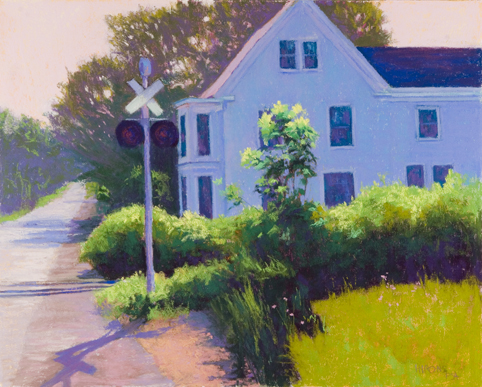
20” x 16”, 2010, Private Collection
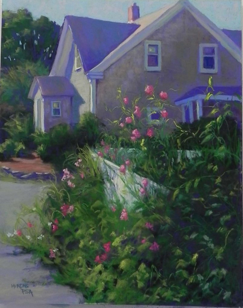
For the painting House With Sweet Pea from Mattapoisett, (below), I’ve used a lot more detail in the thicket of sweet peas than I once thought I’d be capable of. I liked the contrast between the simplicity of the weather-beaten shuttered house and the wild tendrils of sweet peas.
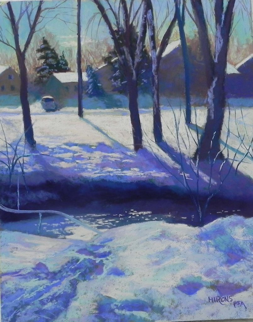
Morning After the Snow (below), is from Rockville, MD, near my house. The modest suburban houses are made lovely by the sunlit snow, while a shadowed ravine leads the eye into the picture. I credit Hopper and Wyeth with helping me see the beauty in the ordinary.
Colorwise, the major influence was the Impressionists—French and American. Their use of color and light and their broken color approach really appealed to me. Rather than being an impressionist, I see myself as a “color harmonist”—preferring limited palettes of complex colors. But I am indebted to them for my love and use of color. I also take great freedom with colors, often going way beyond what would be considered “local color.”
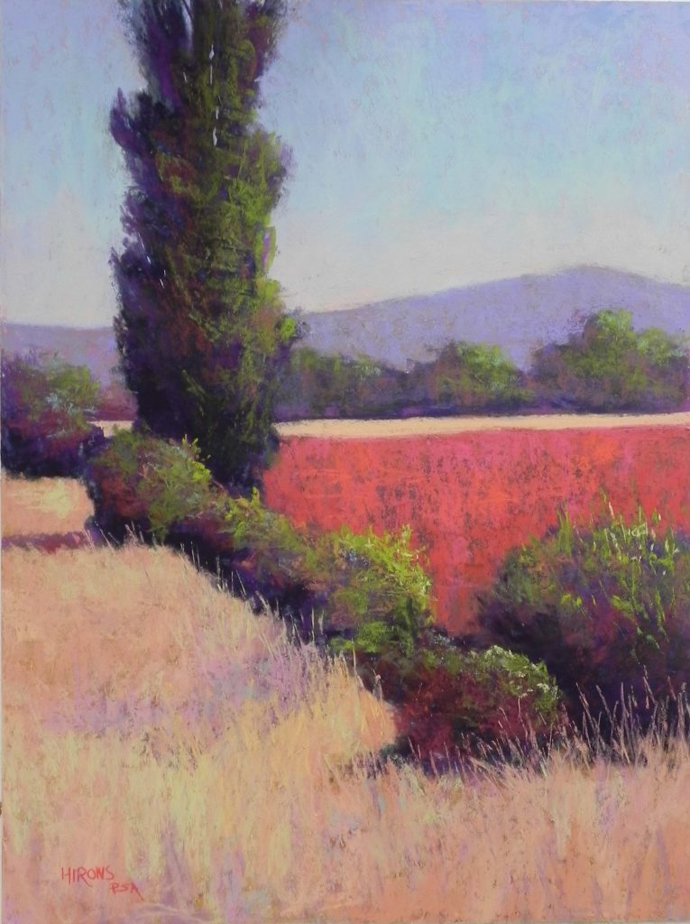
Poplar en Perigord, no 2, is one of two paintings done from black and white photos and a series of color studies. When I find a subject whose color is weak, I often work from black and white. I have learned to “see” color in value. In this painting, the red fields and purples in the tree were made up. Small color studies enabled me to play with various possibilities.
Marsh Walk, (below), created at Chincoteague, was also done from black and white.
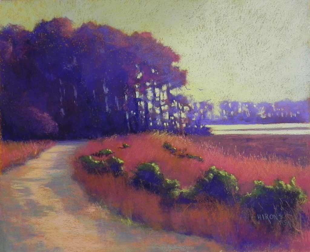
The time of year was spring so everything was green and kind of boring. I chose to use red violets and magentas to give the painting more life and beauty.
I recently created Capitol in Winter. Seeing color in snow that appears gray and white in a photo can be a challenge for many. But I intuitively use a variety of blues, greens, violets, and pinks.
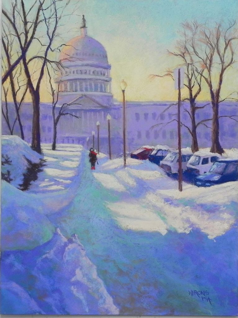
I’ve painted this subject twice from a photo taken in the 1980s when I worked at the Library of Congress.
I am often asked, Why Pastel?
In 1991, I visited Santa Fe and Taos for the first time and saw the work of many pastel artists. What struck me was the brilliance of the color and the variety of styles among the artists. It was evident that pastels could be used to paint or draw or do a combination of both. I was hooked and knew that this was the medium for me.
More practically, I also knew that pastel would give me more control than a wet medium. I’m terrible at mixing paint! When I visited the Southwest I was using colored pencils, a cleaner but less dynamic medium. But colored pencils and pastels share the fact that they are premixed. What you see is what you get!
I began painting with pastel in 1994 when I moved to a house that had a large studio. I was pretty much self-taught until taking my first workshop in 2001. From then on, I took workshops with the major landscape pastelists in the country, attended the biennial conferences of the International Association of Pastel Societies, and became active in the Maryland Pastel Society.
These were years of exploration and learning and I was influenced by a number of my teachers. I tried out most of the available surfaces and pastel brands to determine my favorites. I worked with varying techniques and explored different “looks” for my paintings. From rough landscapes painted on hand-prepared surfaces to softer, more detailed paintings, done on sanded papers, I never tired of learning about pastel.
Yellow House in Winter, (below), reflects the influence of Susan Ogilvie, a pastelist from Washington State. She teaches artists to create their own surfaces using gatorfoam on which is brushed a toned pumice gel. The resulting surface has subtle ridges and lines that can give a dynamic quality to the painting.
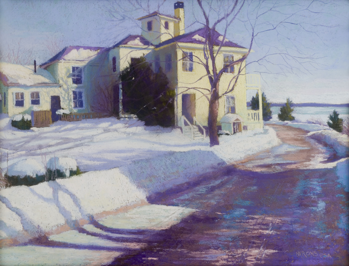
Yellow House in Winter is one of many New England “house paintings” done during this time. Interestingly, I painted it the day after breaking my left arm! Painting my home town was a welcome escape from the present.
The Horse Farm was painted shortly after a workshop with Richard McKinley, one of the most popular of pastel instructors. He teaches the use watercolor washes as an underpainting, letting them drip and sometimes not finishing off the bottom.

The painting was created during a plein air competition in northern Maryland and it’s the only truly successful painting I’ve done using this technique.
In 2013, I leased my first public studio at what is now Artists and Makers in Rockville. And I started working bigger and bolder. Colorado Morning is also done on a hand-made surface but the substrate here is Rives printmaking paper, which provides a much softer, more textured surface on which to work.

The pumice gel, toned with a gold liquid acrylic, shows through giving uniformity to the painting. The large, simple shapes of the western landscape, painted loosely on a textured surface, are influenced by my mentor, California artist Duane Wakeham.
There are two ways in which I now work. Most often, I work on a lightly toned sanded surface (UART) and begin with an underpainting of hard pastels. Using a bristle brush, I add isopropyl alcohol, which melts the pastel and sets it into the paper. This allows me to begin with colors that may be the opposite of the actual color. Since the underpainting is set, it doesn’t mix with the surface colors, which would turn them gray.
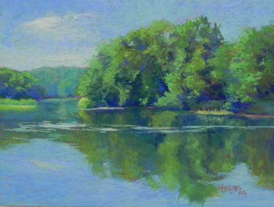
I love this method as it sets out the large value shapes of the composition—I call this my “road map”—and allows me to take my time with the painting.
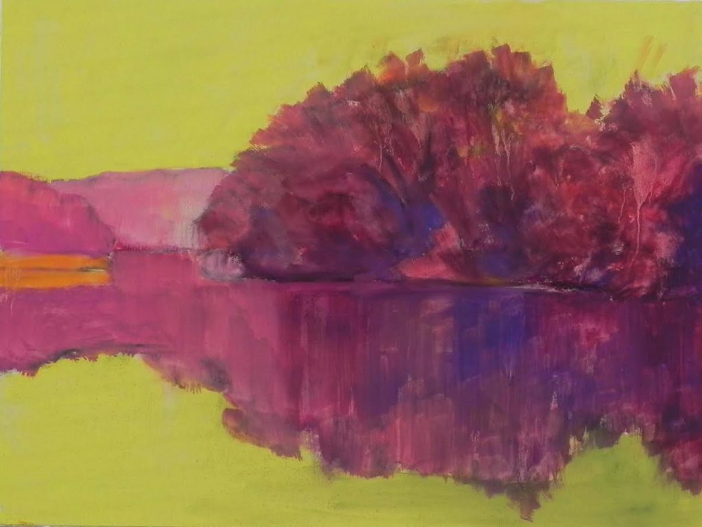
For this typical summer scene of greens and blues I began with warmer reds, pinks and magentas, using yellow green in the sky and water. The surface is pre-mounted UART 320 grit. If you look carefully at the painting, you can see small pieces of the reds showing through.
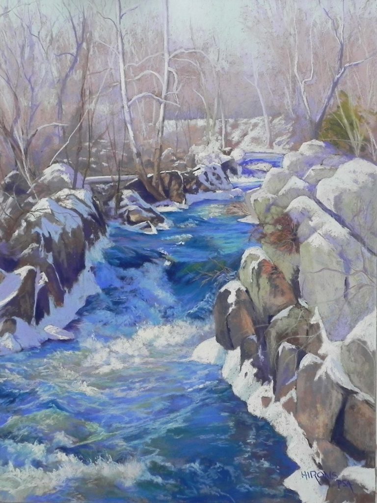
In other cases, I work on a more darkly toned surface, such as the “Italian clay” from Pastel Premiere. I begin by lightly roughing in the value shapes in colors that are closer to the actual color—analogous, then building up layers of pastel from harder to softer brands.
Given the amount of detail in Great Falls Blues (below), working directly on the mid-brown “Italian clay” worked well. An underpainting wouldn’t have been as useful to this painting and I would have lost the drawing.
Teaching Pastel
I retired from the Library of Congress in 2003 and in fall 2005 began teaching a course in pastel at the Rockville Campus of Montgomery College. I taught there until 2012, then began teaching on my own at Artists and Makers. I have discovered that I love teaching and am good at it. It’s become the most important thing I do!
In 2012, I published my book Finding Your Style in Pastel, based on my teaching at MC. The book discusses the variety of materials and techniques that are available to the pastel artist and how they can be combined to create various “looks.” There is also an extensive chapter on color theory for the artist who doesn’t mix colors. And I added my observations on three approaches to color usage—observed, interpreted and intuitive. I had a wonderful time writing the book and it has been well-received.
The focus of my teaching includes understanding values, color theory, and what constitutes a strong composition, in addition to learning about the materials and techniques. My more advanced students are asked to describe why they are painting a subject and what it is they want to say to the viewer. Asking the right questions has always been key to my teaching.
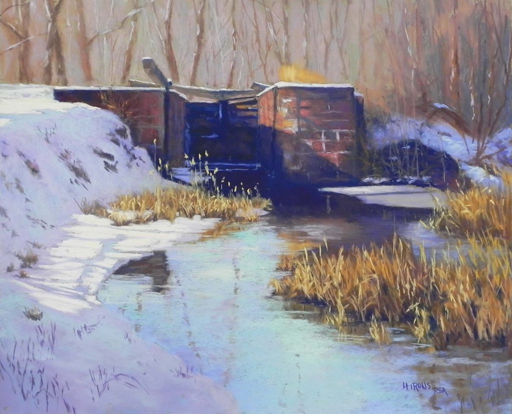
Composition is the basis of all paintings. It is where every good painting starts. In Lock and Snow, the beautiful curve of the snow against the water leads the eye to the more intensely colored verticals of the lock. This is a favorite subject.
Second to composition, is value (the darks and lights of color). Turquoise Pine was created from a black and white photo. The original color photo was green and yellow, a combination I didn’t like.
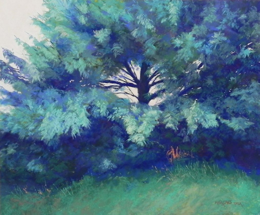
So I used colors that I preferred: turquoises with dark blues and blue violets. Getting the values right made it possible to successfully alter the original colors.
Having been successful with the first painting, a friend suggested I do it again in completely unreal colors. So I painted Hot Pink Pine in shades of pinks and magentas with a few oranges for light.
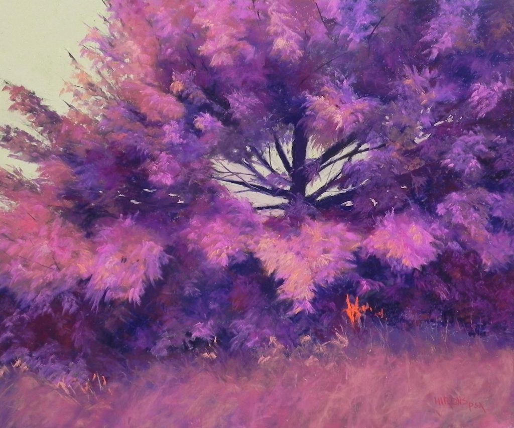
Having a firm understanding of color theory allowed me to create a believable painting. I loved this experience and it proves what I always teach that “value is more important than color.”
Beyond the basics, there is mood. This winter tree in Grace, was painted from a very dull December photo that had no light.
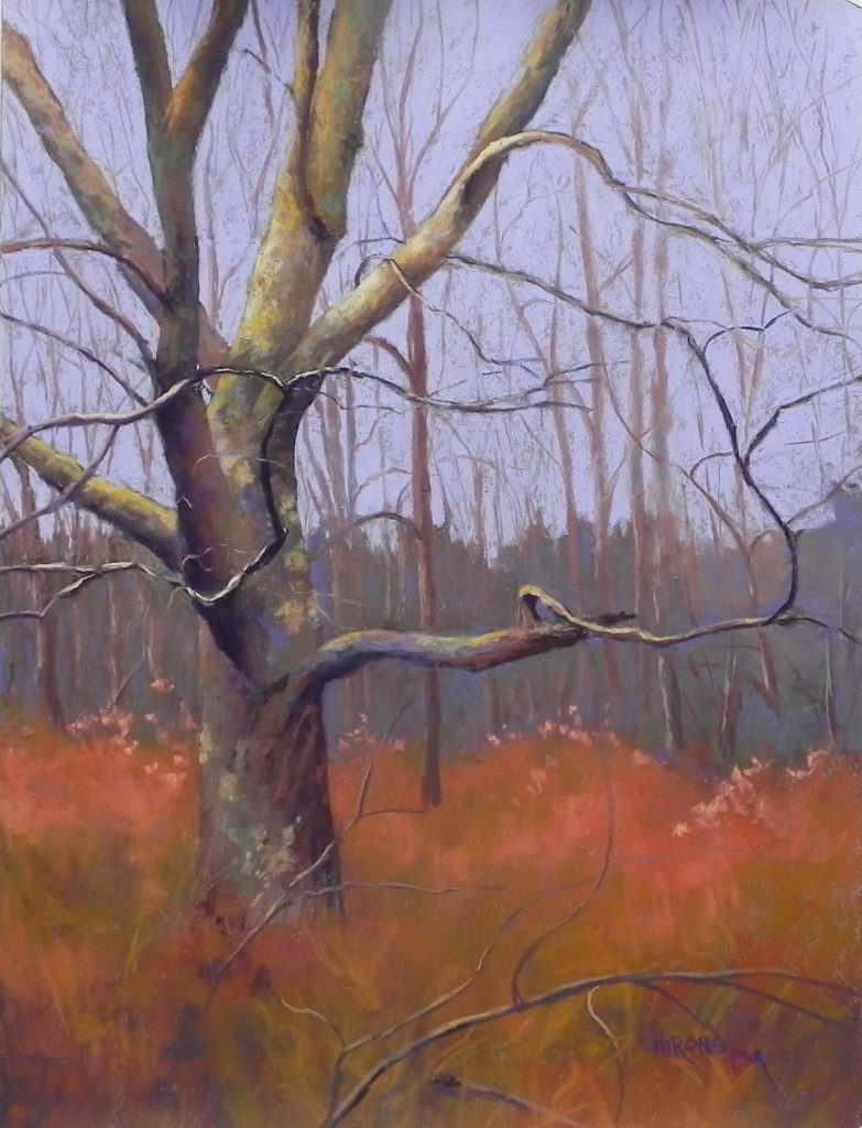
I focused on the variety of colors on the twisting branches, while keeping the sky and background simple, yet beautiful. I felt that the resulting painting has a quiet grace and a sense of peace that wasn’t as obvious in its natural setting.
Recent Challenges
In the past five years, I have been challenging myself with ever more difficult subject matter. Mastering the medium has given me the confidence to take these subjects on.
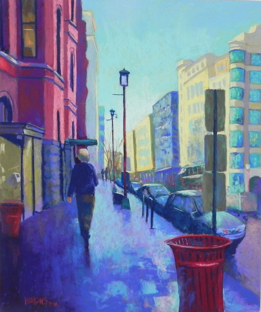
In 2015, I began painting downtown Washington—the canal in Georgetown, the alleys on Capitol Hill and other places of interest. I tried to focus on what makes these areas so distinctive, while dealing with more complicated drawings and perspective, and—for the first time—adding figures to my paintings! I was unsure how to do the figures, whether they should be more real or stylized but in the end, I just added them in the same style as everything else I paint!
In 2019, we took our first trip south of the border to Costa Rica. The bushes, trees, and flowers were overwhelmingly beautiful. I hadn’t planned to paint anything from the trip until I realized that the green leaves and red/pink flowers provided complementary-colored subject matter. I did three of these large botanical paintings.
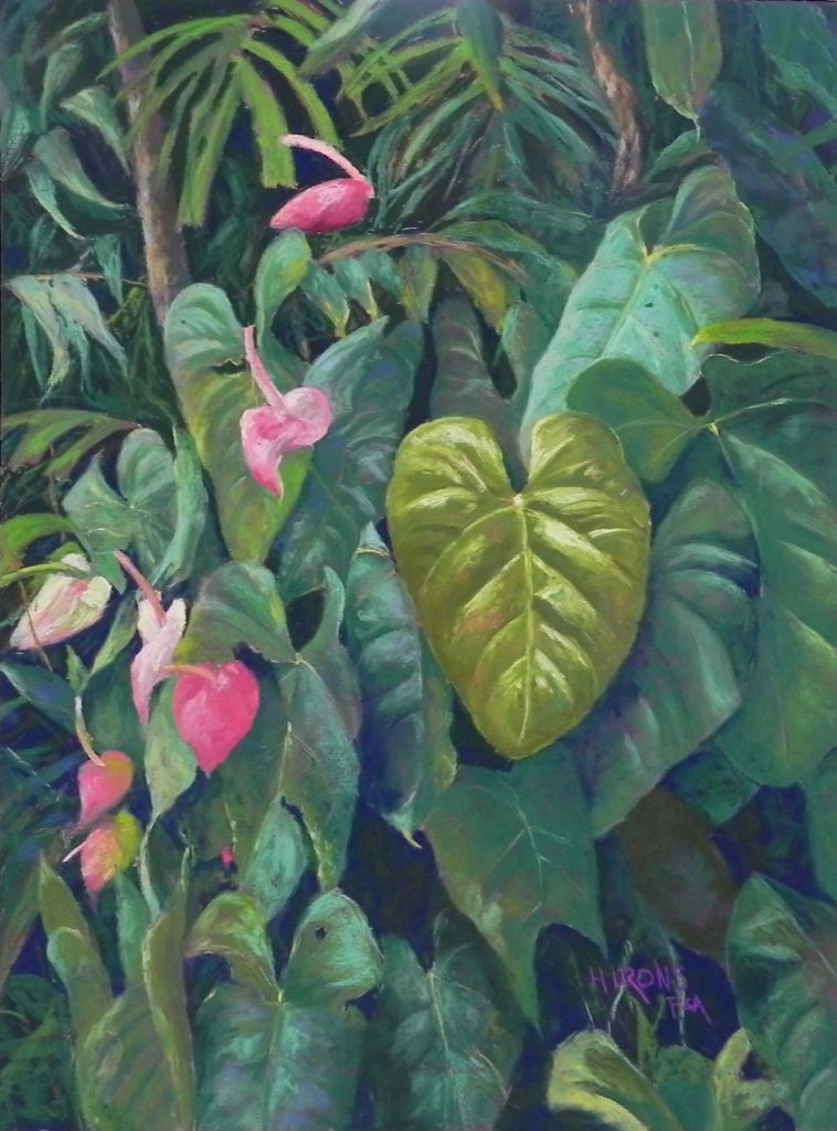
It was a challenge not getting lost in the leaves! In this painting, Abundance, I loved the heart-shaped leaf with its warmer tones, and the lovely play of soft pink flowers dancing up the lower left.
{Image 19: Self Portrait, 2020}
Self Portrait, 2020, 20” x 20”, 2020, Not for sale
In April of this year, being stuck at home and not being able to teach, I knew I needed a new challenge and I decided to attempt a self-portrait. I had done one in colored pencil in the 1980s but never in pastel.
I used a selfie and I liked the rather pensive look, which seemed appropriate for the times.
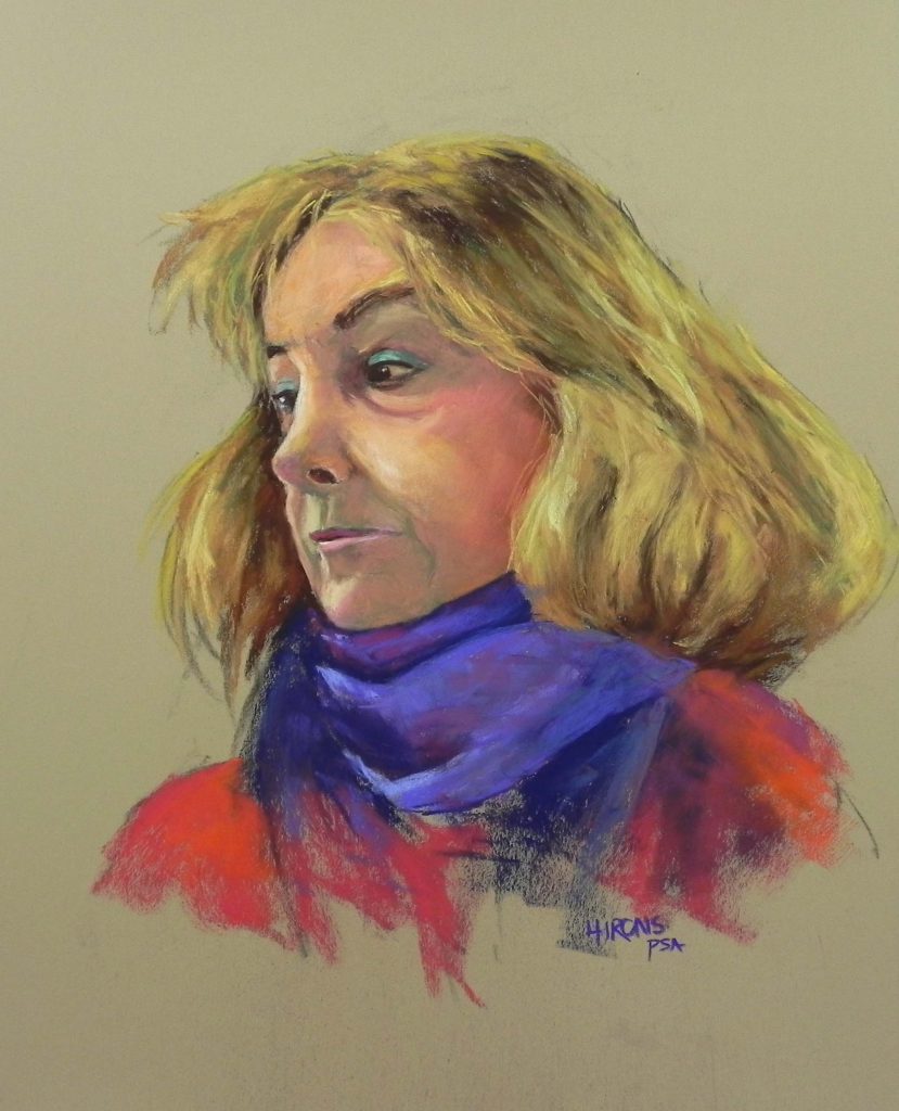
I had little experience with skin tones and probably used too much green, but I had a great time with this picture and was pleased that I could actually do it! After this, I painted an even better portrait of my husband, and another of one of my students. I don’t see this as my future, but I’m happy that I’ve been able to accomplish what I’ve always considered to be the greatest of challenges.
List of Images with year of creation, size and availability. All images are soft pastel:
House by the Tracks /2010/ 16” x 20” / Private Collection
Yellow House in Winter / 2010 / 18” x 24”/ $1550
House with Sweet Pea / 2014 / 20” x 16” / $1250
Great Falls Blues / 2019 / 24” x 18” / $1550
Morning After the Snow / 2020 / 20” x 16” / $1250
Poplar en Perigord, no. 2 / 2015 / 24” x 18” / Private Collection
Marsh Walk / 2015 / 20” x 24” / Private Collection
Capitol in Winter, 24″ x 18″, $1550
The Horse Farm / 2009 / 20” x 16” / Not for sale
Colorado Morning / 2013 / 20” x 24” / $1750
Turquoise Pine / 2020 / 20” x 24” / $1750
Hot Pink Pine / 2020 / 20” x 24” / $1750
Grace / 2018 / 24” x 18” / $1550
Lock and Snow, Great Falls / 2020 / 20” x 24” / $1750
In Chinatown / 2018 / 20” x 24” / $1750 (via District Arts Gallery, Frederick)
Abundance / 2019 / 24” x 20” / $1750
Self Portrait / 2020 / 20” x 20” / Not for sale
Curator’s Note: Stacy Slaten
I want to thank Jean Hirons for being this year’s Fine Arts Topic solo exhibition artist. She has shared her work not only as an artist but also as an educator. I asked Jean to exhibit because of both roles and would serve as an excellent example for both painting, drawing and color theory.
Being an artist is often a vulnerable path. You make something so deeply personal and then present it to the world with an open heart. Not everyone is so fearless. Art can speak things that can’t always be said with words. Through your craft, you help communicate your aesthetic, ideas and help educate burgeoning artists. Our student artists thank you for your example as well as the faculty and staff of NOVA Alexandria.
-Stacy Slaten
For a wonderful pastel how to video from Jean, visit: https://youtu.be/VlrXIqb8VDU

